

Landing page design is, in many ways, a mix of art and science. It has a distinct purpose: to sell someone on your product or service. But while many effective landing pages have similar features in common, if they all looked the same, the reader would immediately lose interest. That’s why you have to make them stand out, hence the “art” piece.
When working with projects that are, like product landing pages, both art and science, you need to understand which parts are the former and which are the latter.
Here, we’ll go into what landing pages are and what you can do with them, talk about best practices and show you all kinds of unique product landing page examples and why we think they’re exceptional.
What Is a Product Landing Page?
A product landing page is like the second step to a product-focused conversion, such as a sale or subscription to a newsletter. A site visitor arrives on a product page after clicking to get there, whether it’s from a link on social media, an organic search engine result or a paid ad.
A core element of a product landing page is that it presumes the visitor reading it is already interested in the product in question, whether it’s a physical product, a digital product or a service. The product page is there to educate and encourage them to take the next step in converting.
A successful product page has a high conversion rate. In short, how many people are reading it through to the end and clicking that CTA?
For example, say you’re a cybersecurity company that makes software suites for small businesses. Your objective, after piquing the visitor’s interest, is to get them to convert. This could mean booking a sales demo, downloading a white paper or another action that benefits your business in some way.
Subscribe to
The Content Marketer
Get weekly insights, advice and opinions about all things digital marketing.
Thank you for subscribing to The Content Marketer!
How Do You Create a Product Landing Page?
In the past, creating a product landing page required someone with coding or web development skills. Since then, automated tools have made the process a lot easier.
There’s no shortage of these tools, so you have a lot of freedom in picking the one that best suits you. Some are specially designed to work well with a WordPress theme, for example. Others have designs more suitable for other web platforms such as Squarespace or Shopify. Feel free to shop around and take your time choosing.
Naturally, you can do away with automatic product landing page design template builders and go for the old-fashioned method with the aforementioned coder or web developer. While more difficult, this method provides maximum choice and freedom: Your product landing page is only limited by what your team can create.
What Can You Do With a Product Landing Page?
First, let’s consider all the different things you can do with product landing page design. You’re certainly not limited to only one purpose with your product landing page — in fact, you’re encouraged to aim for as many of these best practices as possible.
Enhance Your Brand Image
This takes your brand identity and invites your reader to get to know you better. This means having a consistent copy, with a brand-specific tone, style and appearance. If you’re successful, you increase the reader’s awareness of your brand, making it easier to remember you. Even if you don’t make a conversion then, the reader will keep you in mind when they’re considering their prospective options further down the line, leading to future conversions. They might even recommend you to their friends, colleagues and business partners.
Bring In More Traffic
Separate from enhancing your brand image is bringing awareness to your website, your business and its offerings. Remember, landing pages can be SEO-friendly, too, and you want as many people viewing your landing page as possible. The more traffic you can earn with your landing page, the better.
Increase Your Credibility
A good product landing page should be simple, effective and most of all, appealing. Consider adding some social proof such as customer testimonials about your product to give your brand a credibility boost.
Bring In Leads
Of course, you want a potential customer to do what your CTA copy suggests. Remember, anyone who arrives at your product landing page already has some interest in what you’re selling. The copy should be one of, if not the final step in converting them.
How Do Product Landing Pages Differ From Other Types of Content?
Product landing pages are different from other internet entities such as blogs, pillar pages, eBooks and alternative types of content. Let’s go into a few common examples and how they differ.
Blogs
Yes, many blogs have a clear CTA ready to convert the reader. But a blog takes a different approach for a potentially dissimilar audience. Product landing pages are specifically about selling a product to someone who’s already shown interest in it. Blogs tend to be more educational in nature and often bring in people who want to learn more about a topic — not simply a product or service. If there’s ever a mention of a product in a blog, it’s in the CTA, if at all. So while product landing pages are about conversions, blogs are meant to improve a brand’s authority in a particular topic.
Pillar Pages
Pillar pages are one of the first pages your audience goes to when they need information about one or several subjects. They’re essentially a form of content hub. If your website is a tree, then pillar pages are the heartwood of your site, with many branches leading to different areas for particular inquiries. This type of page comes in several varieties, such as services pillar pages, resource pillar pages and high-value content pillar pages.
For a great example, break down the structure of this pillar page on keyword research. The first thing you’ll probably notice is that it’s long. It has to be because it basically answers all you need to know about keyword research, with frequent links to other resources on the site that go into further detail about subtopics.
In any scenario, it’s clearly not a product landing page. A product landing page is comparably simple, to the point and laser-focused on making conversions. People also don’t wind up at pillar pages the same way they do product pages — pillar pages are sought out by those who want an in-depth understanding of something, whereas landing pages are for people interested in a product.
eBooks
eBooks are long-form pieces of content marketing that go into great detail about a subject related to the brand. They’re similar to pillar pages in that they tend to be longer than product landing pages, but pillar pages try to answer a wide range of questions at one time. eBooks can have CTAs like other forms of marketing and they’re targeted toward people who want to learn more about a particular product or subject.
However, just like the previous example, they tend to be far too long to make effective product landing pages. Yes, they can be focused around a product and are for those who want to learn more about it, but an eBook is more likely to be the end goal of a conversion. It’s not uncommon for a blog or product landing page to lead to downloading an eBook.
Product Landing Page Examples
OK, so we’ve talked about what product landing pages are and aren’t. And by now, you should have a strong understanding of what the point of a product landing page is.
It’s time to give you solid examples of effective product landing pages and pick out the best practices used in each.
Draggable
Draggable is software that enables you to add easy drag-and-drop functionality to your website with a built-in JavaScript library. The first thing you see on this landing page example is the headline containing precisely what the product is in as few words as possible followed by two options: “Download” and “Examples.” “Download” gets you to download the software, whereas “examples” demonstrates the product in action. The site puts its CTA buttons front and center.
Scroll a little and you’ll find the opening paragraph:
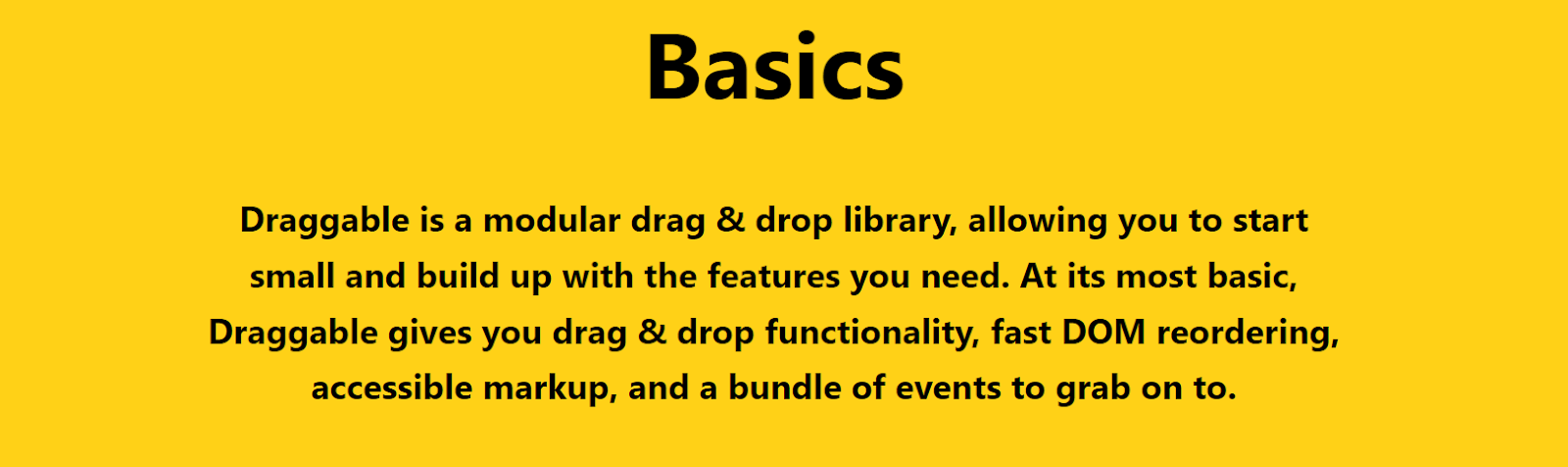
Notice how perfectly simple and straightforward the language is. With one quick overview, you should have a good idea of what the product offers and some of its core features. But there’s more than just copy to look at: There are also colorful, eye-catching abstract designs and animations that define the brand’s identity. Continue down the page and you’ll find more features being demonstrated. It even has sound and interactive elements that encourage you to engage with its offering.
I didn’t go to this product landing page example for anything other than research reasons, but even I couldn’t resist playing with the wonderfully aesthetic toys the page lays out for you to sample. It’s professional, it’s eye-catching and it’s fun.
Apple AirPods Max
Yes, we’re mostly talking about B2B product landing pages, but that doesn’t mean you can’t borrow lessons from a brand that’s practically famous for its marketing. As you’ll instantly figure out by clicking on Apple’s product landing page for its AirPods Max, this product is a set of headphones meant to appeal to audiophiles and Apple fans.
Check out how Apple-y this page is. The exceptionally basic, black-and-white design and color scheme scream simplicity, quality, functionality and everything else that makes Apple, Apple.
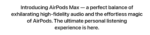
Apple knows that if you’re on this page, you’re already interested in the product. So it lays out exactly what makes the AirPods Max stand out in its headline, which happens to be the things both audiophiles and Apple fans tend to want: high-fidelity audio and quality befitting the title of AirPods.
Scroll a little further and you’ll see eye-popping, high-resolution animations of the product behind the qualities they put in big, bold letters: “High-fidelity audio” is repeated, then “Stunning design with an exceptional fit,” emphasizing style and comfort. Scrolling further lets you interact with the page: The more you scroll, the more product features are listed with more ultra-high-resolution images of the product.
Make it to the end of the page and you’ll get comparisons of Apple’s AirPods offerings, from the second-generation AirPods to their most premium offering, the Max. If you’re still unsure at this point, Apple gives you other options that might be a better fit for you. The graphic designs representing the different features let you easily distinguish between each product.
All the essential features you’d want in a pair of over-ear headphones are listed out with brevity, precision and above all, style. Nothing is wasted in this product landing page example. It really does show Apple’s brand at the top of its game. Heck, you could remove all the words on the page and you’d probably still be able to tell it’s an Apple product based on the unique brand design alone.
Semrush
As one of the most popular tools for keyword research, Semrush is a household name in content marketing. It also has a killer landing page.
Right out of the gate, Semrush tells you what you can do with it in its headline and immediately gives you a chance to try it out for yourself.
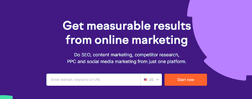
Anyone with even the slightest bit of curiosity can give their service a shot right then and there.
Continue scrolling and you’ll see a list of major brands that use Semrush, giving the product credibility. Amazon, Samsung and Walmart are some notable inclusions. Who wouldn’t want to find similar success by using the same SEO products they use?
Following that, you get more details and features captured in a pleasing color scheme with a simple interface that encourages exploration of its core components, from SEO to agency solutions. Each section has a button that lets you find out more: For SEO, there’s “Try SEO Toolkit.” Under Market Research, you can see “Try Competitive Research Toolkit.”
Then you’ve got customer reviews to further boost the product’s social proof. The page really wants to emphasize that it’s one of the most trusted sets of services for the most successful companies in the world. There are more statistics in big, bold letters that explain how many people use the product, how many awards it’s won as “Best SEO Software Suite,” and another number that illustrates its special popularity with Fortune 500 companies.
At the very bottom, you’ve got the CTA button in glorious orange and white. It encourages you to try all its toolkits for 7 days. If you’re looking for an effective set of tools to boost your business, why wouldn’t you take advantage of the offer?
Slack
At the heart of Slack is a communications system for businesses that can also implement other third-party apps such as Google Calendar and Zoom. Especially useful for remote work, Slack was the first app of its kind. Yes, there were chat apps before Slack, but none brought the entire experience together quite like Slack did. So what makes Slack’s product landing page stand out?
Just like Slack’s initial idea of being a comprehensive communications app, the way it presents its landing page covers all the bases and hits the proper elements to make a very appealing landing page.
The first thing you’ll probably notice is its two-toned headline on its signature purple background: “Great teamwork starts with a digital HQ.” Right away, you get a solid idea of what Slack is all about. There are a couple of keywords to pick out from this text: “teamwork” and “digital HQ.” It could easily be said that Slack is about those two terms, and they appropriately stand out as one of the first elements on the page.
Alongside the colorful text is an animation demonstrating the product’s primary function, giving context to the words. You can see 2 different channels, with different people doing business-y things. It’s obvious this is a B2B product based on the animation — something you might not intuitively understand if the text were alone.
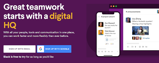
Then you’ve got a CTA button in a couple of side-by-side varieties, with 2 ways to sign up. These buttons are accompanied by a claim that puts the most important part in bold: It’s free to try. Your eyes naturally read the rest of the text, which adds the important fragment of “for as long as you’d like.”
What follows is all the proper elements of a landing page. Like Semrush, companies with household names are put front and center as businesses that take advantage of Slack for that sweet social proof. This is further boosted down the page with bold statistics such as, “85% of users say Slack has improved communication” and “86% feel their ability to work remotely has improved.” The breakdown of features including “Learn more” links all have animated illustrations to go with them, showing you the product in action.
Slack does a superb job of explaining its product and demonstrating it at the same time. While there’s a lot on the page, it never feels like it’s too busy or that your attention is distracted by something irrelevant. It all flows easily, and by the time you’re done, you know how to use the product and why trying it for yourself is a good idea.
Hotjar
This product landing page takes what might traditionally be conceived as a tame subject — website data insights — and makes it cool.
The first thing the page points out in its headline is what their product can do that typical data analytics can’t: “Numbers tell you what’s happening. Hotjar’s visual insights tell you why. So you can make the changes that matter.” You now know not only what Hotjar does, but what makes it unique and why that matters — and it does all of that in three brief sentences.
Hotjar knows credibility is key, so it makes sure to include how many companies use it and some big names: Adobe, Microsoft and Nintendo are users of this product.
This is all well and good, but that doesn’t really give you an idea of how the product works. That’s why the next section is designed to pull your attention in, offering an animation of the product in action. This part of the landing page is especially wonderful: It’s colorful, interactive and — for a product that is essentially visual data analytics and insights — surprisingly engaging. You can click on the service’s individual capabilities for extra information that’s presented with animations of the kind of insights you can get.
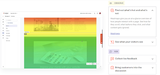
For those who want to know about integrations with other services such as Google Analytics, the product landing page helpfully points that out, too. If you want more specific information about the third-party applications Hotjar can be implemented with, there’s a link where you can explore more.
Hotjar, clearly knowing what makes a good landing page and what people want to know when they arrive at one, adds customer testimonials, addresses privacy features and includes a big CTA button on how to get started.
All in all, Hotjar excels in making its product seem exciting. This is a substantial feat considering that it’s trying to sell you on data analytics software. It’s an especially nice touch that they offer a free Basic plan for you to explore the product’s features in case you’re unsure whether the product will work for you. This might be helpful in case you’re an especially small company and aren’t sure how you could benefit from data analytics yet. But a free plan means you have nothing to lose.
Absurd Design
Absurd Design is a service that provides illustrations to use on your own website. The product landing page claims that the illustrations are a one-person show. But their landing page is far from amateurish. In fact, it gets all the elements right and still goes out of its way to stand out on this list.
Most notable about this page is its color scheme with copious amounts of white space. Only 3 colors are used: black and white with yellow accents in some areas. The brand fully understands that it needs an attractive and identifiable brand color palette to define itself, and its minimalist graphics manage to be appealing and easy to remember.
Seeing as this is a service that sells illustrations, you would naturally want to see some samples. Not only does the page provide them, but it does so in a way that highlights each individual piece and what makes it unique. For example, the very top of the page has a big design resembling a birdhouse connected to a wind-up box with legs next to the headline. It’s, well, nothing if not absurd. But the landing page is betting that’s exactly what you’re looking for and are willing to scroll more.
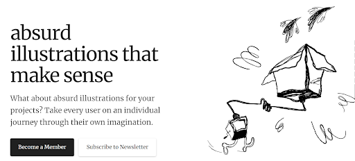
The next section really emphasizes the artist’s strategy with their illustrations: “In a digital era, we sometimes feel the need to interact with something more human that will make us appreciate both the beauty and the imperfection of something made by hand.” This text is accompanied by another design that looks like a walking knot with flowers coming out the top of it.
One might think, sure, they’re nice illustrations, but what can I do with them? That’s what the animation in the next section is for. It features an “illustrations for” with changing endings to the phrase. For example, it shows “landing pages,” “articles,” “apps” and “presentations.”
The company is a one-person show, so they use this to their advantage by mentioning the exclusivity of being a member: There can only be a maximum of 300 at any given time. This is followed by the 2 plans you can sign up for — and the number of seats left. The page saves the proof of credibility for last, with its various mentions on popular platforms.
Absurd Design might be a small company, but you wouldn’t know going by the exceptional quality of its landing page.
A Crucial Step To Successful Conversions Is an Exceptional Landing Page
Here, we’ve tried explaining both the science and art of product landing pages. Hopefully, these varied examples will lead you to understand what makes a great landing page and inspire you to create something equally amazing for your own product or service.