

Got a blog post? Put an infographic on it!
Portlandia throwback aside, adding infographics to your blog content can generate significant results for your bottom line.
Not only are they beautiful works of digital art, highly shareable and great for getting your brand out in front of eyeballs, they also pack a serious SEO punch.
How?
Let me explain:
The Story
We have a lot of blog articles. I’m talking thousands upon thousands of posts. We’ve been at this for a long time – the Brafton blog turned 11 this April.
And we’ve been adding infographics to our blog posts since 2014. We’ve done this for all the reasons mentioned above. Specifically, we knew they were good at organically generating backlinks for us.
But exactly how good are they at generating backlinks?
And what other types of results can we expect from these visual masterpieces?
And what happens if we scale the number of infographics we produce and publish per month?
These are all questions we were looking to answer at the beginning of this year.
Subscribe to
The Content Marketer
Get weekly insights, advice and opinions about all things digital marketing.
Thank you for subscribing to The Content Marketer!
What We Did
So we scaled our infographic production and published roughly 25 infographics in the first half of 2021. Our goal was to publish ~1 infographic per week.
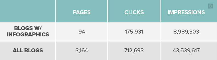
By the end of May, we had a total of 94 blog pages with infographics. Including the ~25 newly added ones from this year.
Here’s what we found:
SEO Results
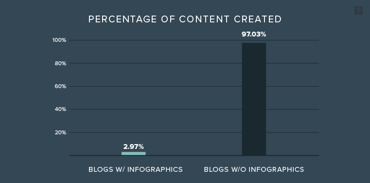
Data from Ryte (& Google Search Console), 1/1/2021 – 5/31/2021.
The takeaway here:
Blogs with infographics make up ~3% of all of our blog pages.
However, they generate 25% of all the clicks to our blog pages and 21% of all the impressions generated by blogs in search.
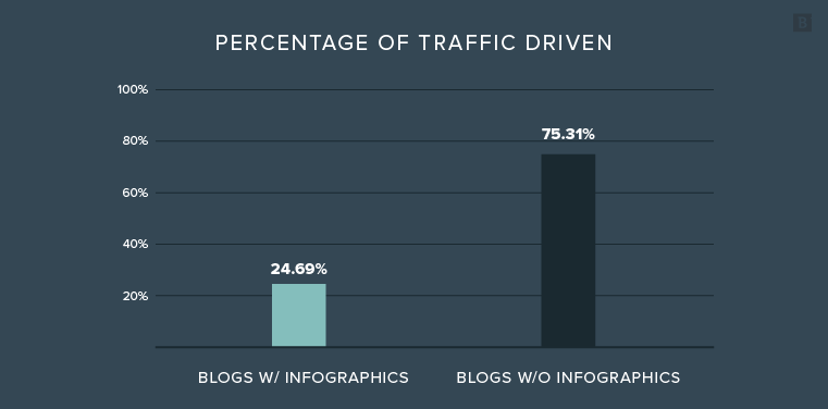
Right away we can see that this relatively small portion of articles is generating a large proportion of results for us.
Blogs with infographics also have a higher average click-through rate (2%) versus all of our blogs, which, on average, have a 1.6% click-through rate.
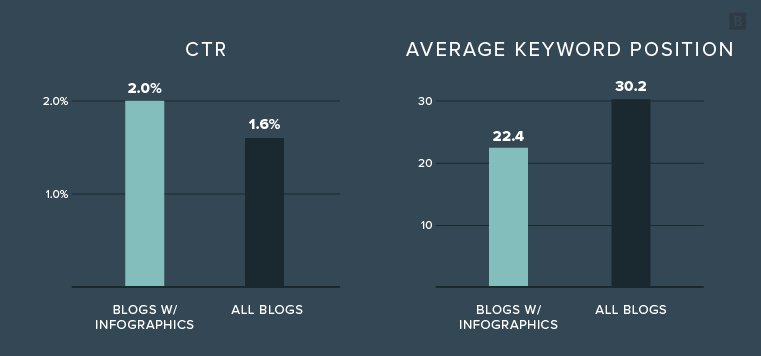
And they have a better average keyword position for their target term (22.4 vs 30.2).
These facts were a little less surprising since we typically only add infographics to our best-performing blog posts. And the top performers are usually selected based on how much traffic they drive (and CTR and keyword position make a big difference in that performance).
Now, here’s where it gets interesting:
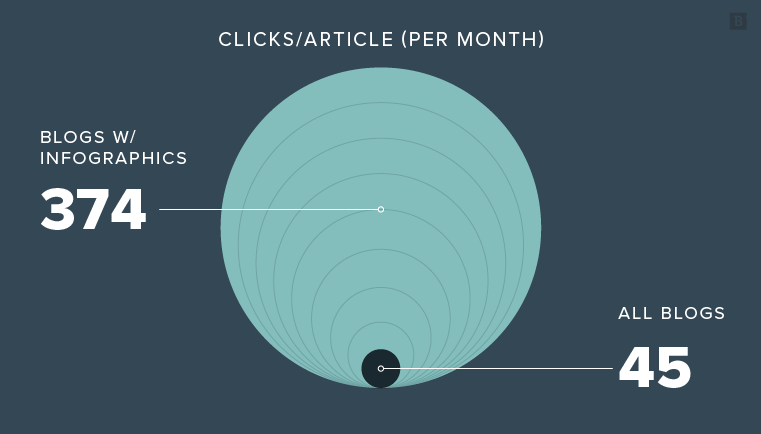
Articles with infographics drive 8x more clicks than those without.
That is a sexy statistic if I do say so myself! You’re welcome.
How We Use This Data
This data is highly valuable for determining the monetary value of the content we’re creating.
And for projecting how changes to our production/publication frequency could impact our results.
For example, now that we know, on average, how many clicks a blog with an infographic generates monthly, we can project how many sessions we’ll see on the site in a year from that added content.
We can then project out how many sessions we might generate if we added X number of infographics to our blog posts in a year.
Compare that to the cost to create the infographic, and no matter how many infographics we decide to create in a year, we know we’re making an extremely educated decision.
It’s a win-win.
Now bring on the infographics!
Referring Domains: The Icing on the Cake
Blogs with infographics generate more backlinks than blogs without infographics. This isn’t really surprising, because we know that on average, they rank better and have a better CTR (from the above results).
More people are getting to these pages, and therefore more people are likely to link back to them.
It’s the virtuous cycle of SEO.
But, again, we wanted to know how much of an impact infographics are having on blog posts when it comes to generating inbound links.
So we did an in-depth analysis of (nearly) every single blog post that we added an infographic to in 2021.
19 total were analyzed (*out of 25).
*4 were excluded from this study because they had just been published, so it was too soon to look at results. 2 were excluded because they already had infographics (pre-2021) and only additional visuals were added in 2021.
Here’s what I found:
Link-Building Results
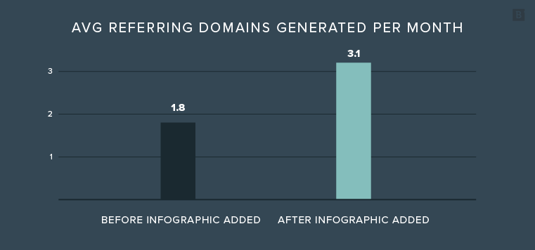
On average, before the infographics were added, each blog post was accruing ~1.8 new referring domains per month.
After we added the infographic to the blog, in most cases, it started accruing more backlinks per month. On average, the blogs where we added infographics this year are now accruing ~3.1 new referring domains per month.
Here’s a few examples of what this looks like over time:
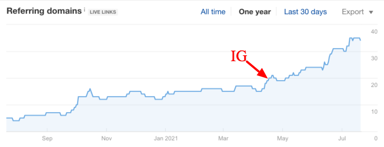
Blog post: 7 Blueprints for Email Copywriting That Works + Examples (Infographic)
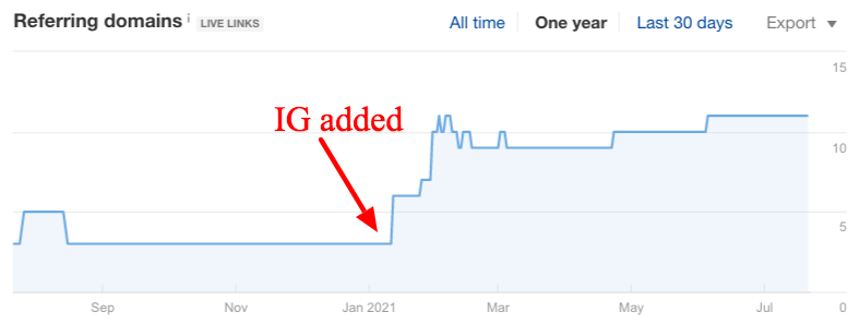
Blog post: The Anatomy of a Marketing Ideation Workshop (Infographic)
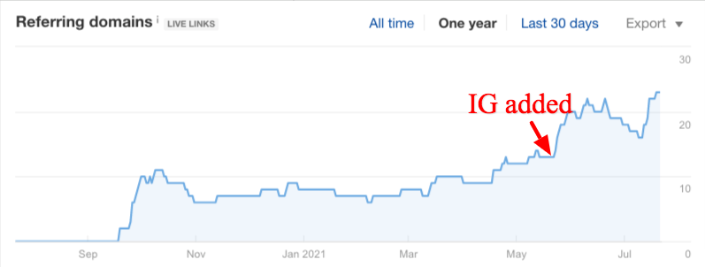
Blog post: Digital Presence: What It Is and How To Expand Yours (Infographic)
Takeaway: Blogs with infographics generate nearly twice as many new referring domains per month as those without.
And for content we purchased/created once – it continues to organically generate new links.
Bonus: Google Image Search
Another added benefit is that the more infographics we add to our blog articles, the more likely we are to show up in Google Image Search for our target terms.
Here are a couple of examples:
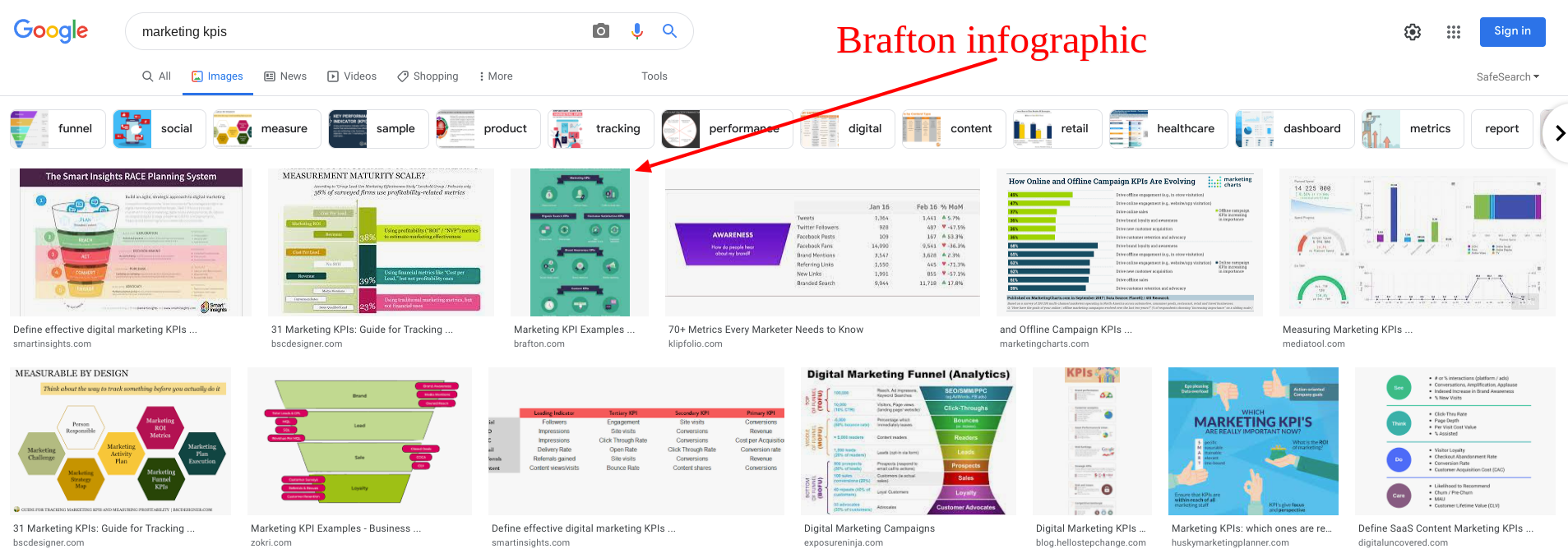
Blog post: Top Marketing KPI Examples (Infographic + SlideShare)
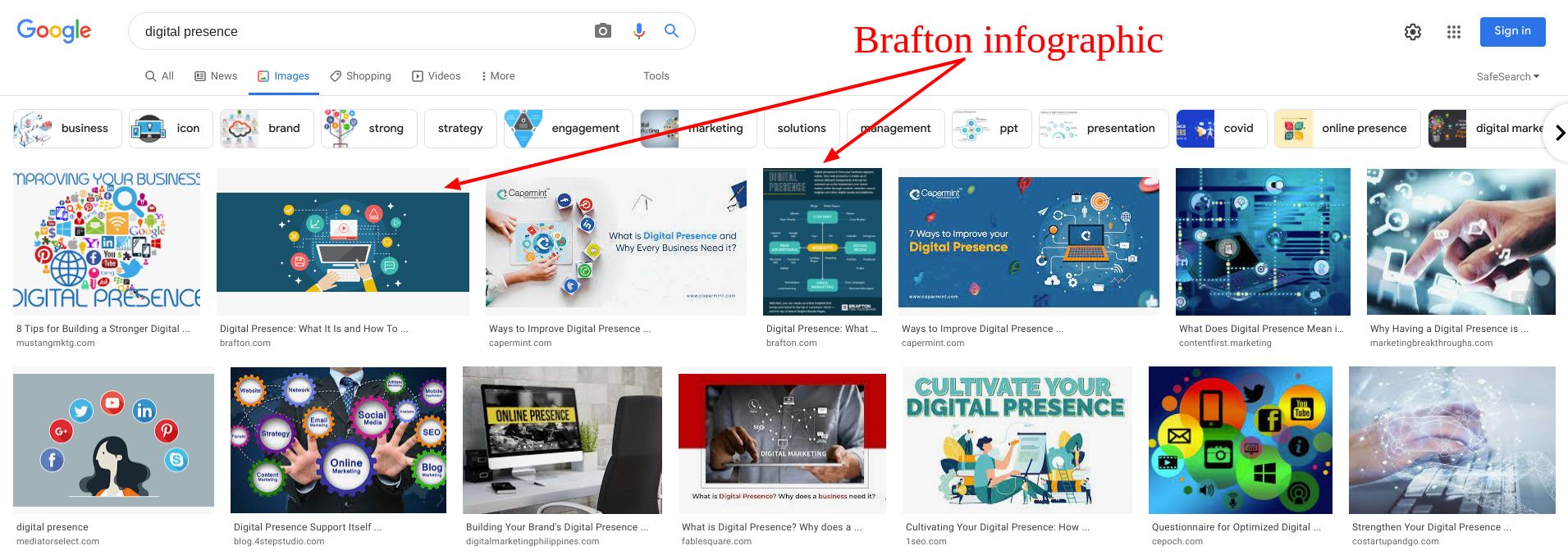
Blog post: Digital Presence: What It Is and How To Expand Yours (Infographic)
This should also improve our chances of getting more backlinks.
And the virtuous cycle of SEO continues.
So, believe me when I tell you: “Your blog post would look sooo great with an infographic on it!” 😉