
Trust is a critical issue for brands, both new and old. A recent SurveyMonkey survey found that 65 percent of respondents said that trust in a brand matters “a great deal” or “a lot.”
It’s also hard to build trust. Most consumers prefer to buy from established brands, not new startups, unsurprisingly.
And when a brand loses trust, through poor customer experience, for example, it can have a critical impact on growth and profit. Accenture’s survey of 7,000 brands that experienced a decline in trust lost $180 billion in potential revenue.
So, why do we trust certain brands?
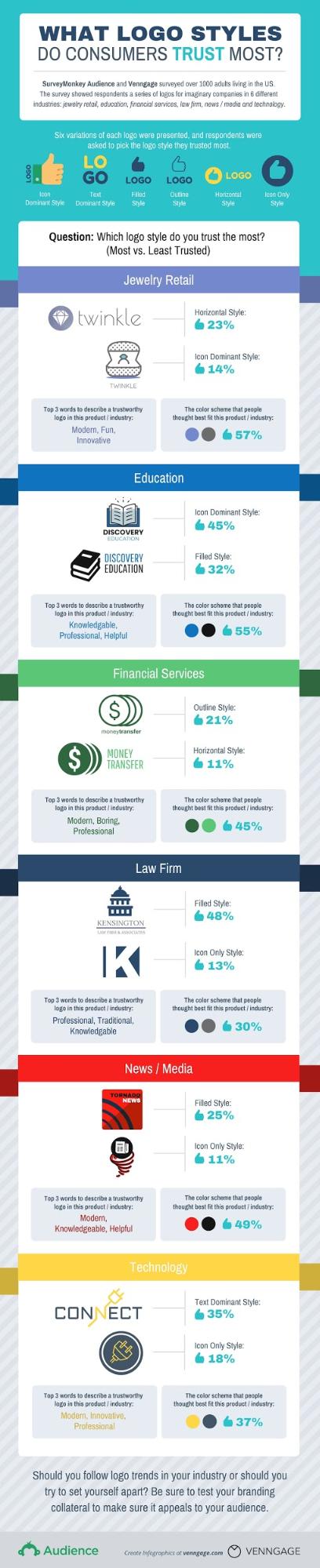
Venngage and SurveyMonkey teamed up to look at brand trust through the lens of logo styles— specifically which logo styles consumers find the most trustworthy.
To do this, we surveyed 1,000 adults over the age of 18 in the U.S. Respondents looked at logos for imaginary companies from six industries:
- Jewelry retail.
- Education.
- Financial services.
- Law firms.
- News/media.
- Tech.
Here’s what we found:
Gender and age don’t influence trust, but familiarity does
Our survey found that men and women prefer the same logo styles. Even different age groups agreed that certain logo styles were more trustworthy than others.
That said, all our respondents looked at logos for gender-neutral brands. Gender-specific brands, like beauty brands, might have sparked a difference in opinions. Men and women may have different ideas about whether a design represents a masculine or feminine product.
As for age groups, opinion diverged only when it came to news media logos. Consumers over the age of 60 preferred filled logo styles, like CNN and Fox News’s logos.
Consumers 60+ are already familiar with these established news outlets, ones that tend to have an older viewership.
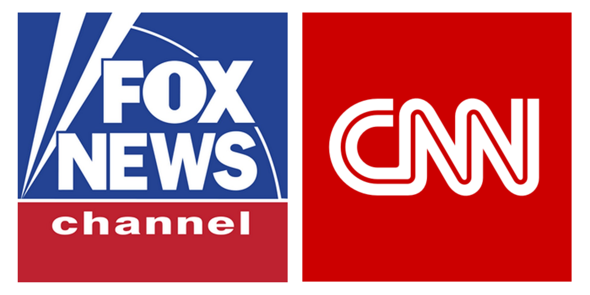
So, you could say that age groups tend to trust news logos that resemble those they already trust.
This turned out to be a theme throughout our results.
Education and financial services logos were the most trustworthy
Respondents agreed that they trusted education and financial services logos the most. Education logos were the most trusted of all.
Why? It’s possible that education brands are associated with research and expertise.
On the other hand, respondents trusted law firms, news/media and tech logos the least.
We can only speculate these industries have more negative associations. For example, a news/media brand could be related with bias and consumerism.
Again, pre-existing biases probably affected respondents’ choices of which logos to trust.
Using tools to monitor your social media presence can be one way to get a sense of your reputation and whether consumers trust your brand.
People may trust “less trusted” industries if companies are upfront
And by “upfront” we mean if these companies are clear about who they are and what they do.
Survey respondents told us loud and clear that the least-trusted logo style for law firm, news/media and tech brands was icon-only.
The most trusted logo styles were the filled style (law firm, 48 percent and news/media, 25 percent) and text dominant (tech, 35 percent).
This could be due to filled and text dominant logo styles offering a better indication of what a company does.
Logos with similar color schemes and designs to other industry logos may be more trusted
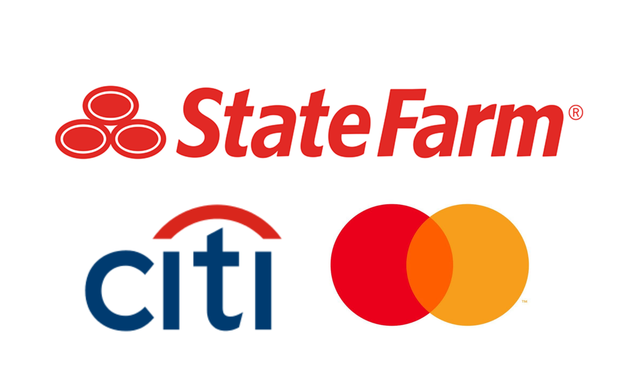
For financial services brands, our respondents told us they trusted the outline and text-dominant styles the most. They described them as “modern,” “boring” and “professional.”
Not surprisingly, the most-trusted logo styles in this category strongly resembled existing financial services logos like State Farm and Citi.
The same scenario applied for education brands. Forty-five percent of respondents trusted icon-dominant styles the most, probably because they resembled logos from the likes of Scholastic.

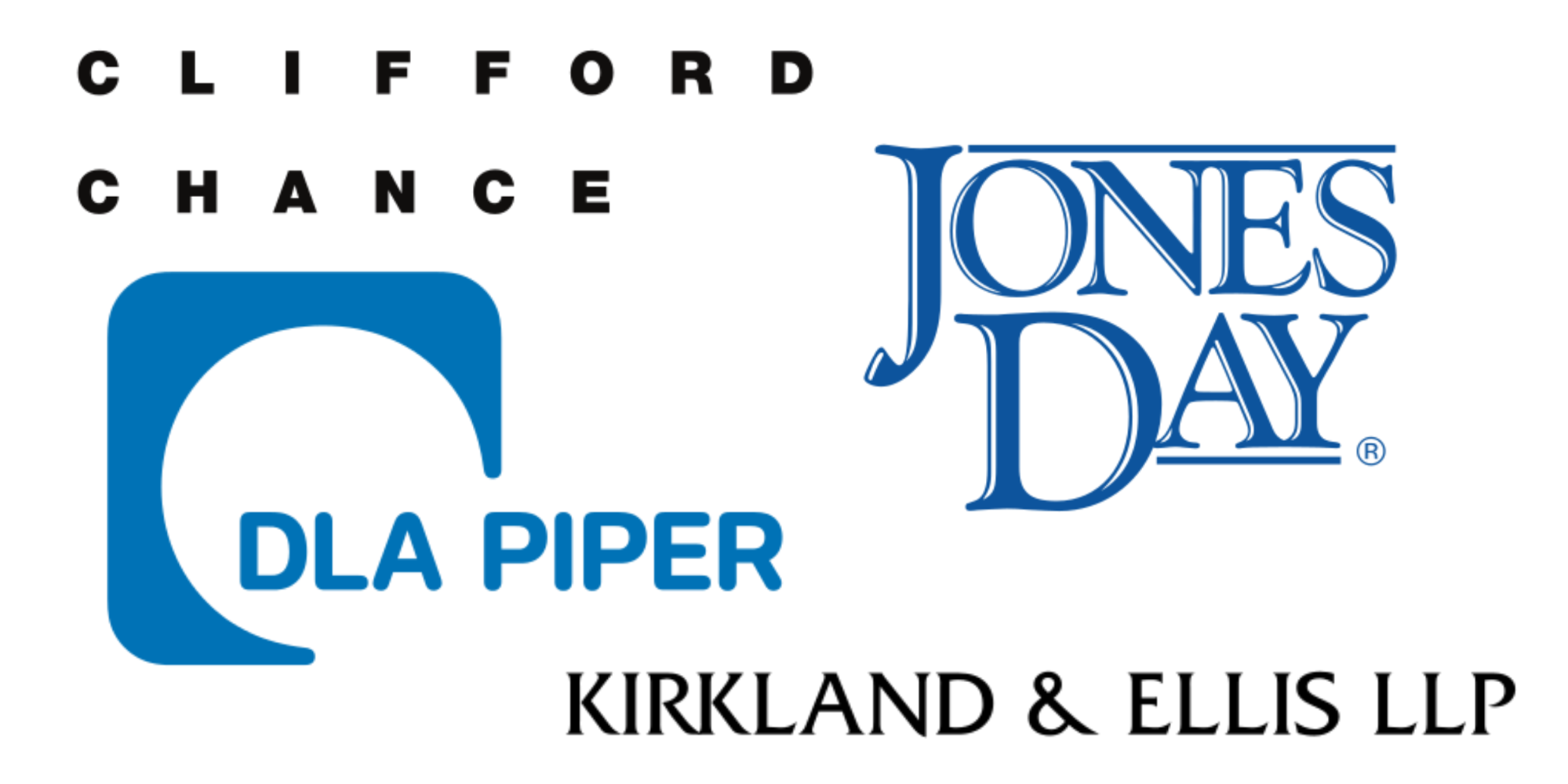
For law firm logos, respondents favored blue and gray color schemes. Top American law firms like Jones Day use the exact same brand colors. So, embracing “same-old” could work for some companies.
Still, there’s room for brands to differentiate themselves
In some industries, consumers may be looking for brands to do something different from the industry standard.
For example, respondents trusted jewelry retail logos that were “modern,” “fun” and “innovative.” This seems like a departure, given that the jewelry business is filled with many established companies.
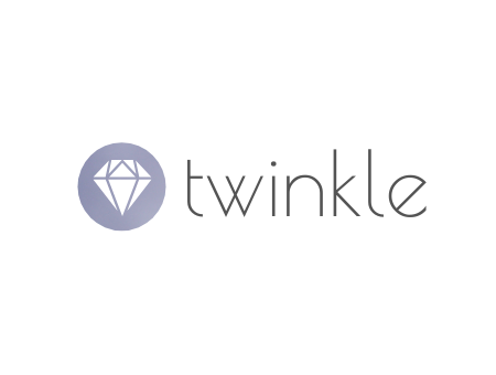
New and popular jewelry brand Mejuri has a sleek horizontal text-dominant logo. This reflects its jewelry’s minimalism.

So there could still be room for companies to depart from current graphic design trends or existing standards, depending on the industry.
The takeaway: Test everything
Our data shows that the perceived trustworthiness of a logo has a lot to do with whether consumers already trust a particular industry. Even the best logo may have a tough time changing these preconceived notions.
It’s important to take this into account. Sometimes pouring endless time and resources into logo design simply isn’t going to make a brand appear more trustworthy.
Consider building consumer trust in different ways, while taking into account the specific challenges of your industry. A solid customer retention strategy is one must-have to improve trust.
Another takeaway is that the perfect overall logo design doesn’t exist. That’s why it’s important to test your branding with your audience and see what resonates: logos similar to competitor designs, something completely different, or middle ground?