
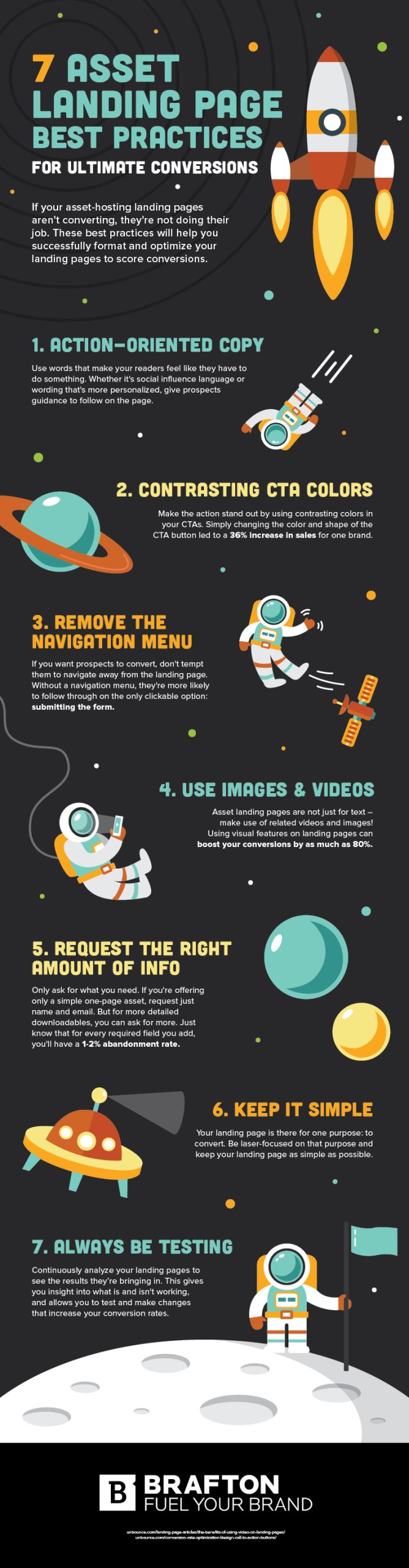
Conversions. Ah, one important word that is music to marketers’ ears.
Conversions don’t happen by a stroke of luck. They happen when a brand works hard to create content that effectively reaches a target audience and convinces them they need more information about a product or service.
One of your most successful tools for converting prospects while also giving them valuable information is the asset landing page. Acting as a “gatekeeper” for a white paper, eBook or other piece of content, these types of landing pages help companies generate leads by gathering contact info and other pertinent details.
But you’re not going to get those conversions simply by putting up a form and a “Download Now!” button on a landing page. You must focus on incorporating the right elements, content and features on your asset landing pages to turn them into converting machines.
1. Lights, camera, ACTION!
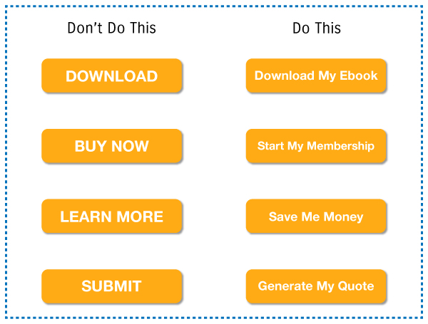
What’s the first step for a conversion? Getting your visitor to complete an action. Get them to complete that valuable first action by using language in your CTA that makes them feel like they must do click on it.
Brafton Director of Digital Marketing Strategy Jeff Baker explains that there are several approaches to this. First, you can use “fear-based” language. Think along the lines of those virus scan pop-ups you see that say something like “Download now to save your computer from dangerous viruses!” Depending on your goals, however, this may not be the best route to take – you don’t necessarily want to scare your prospects into converting.
Another – and more tame – approach is to use “social influence” language. An example of this would be “Join your 50,000 peers in learning more…” This verbiage might also instill some small amount of fear, but it’s more along the FOMO mindset rather than doomsday thinking.
The “personalized” approach is a different way to use action-oriented copy, Jeff says. Language such as “Start my membership…” can make readers feel special and that they must take advantage of the CTA.
2. Yellow plus blue makes conversions for you
There’s a whole lot more to the colors of CTAs than you might think. Jeff explains that marketers should play to human biology when selecting and using colors.
“Humans are tuned into things that stand out from the crowd,” he states. “This comes from us seeing things as either a threat or opportunity. We are wired to look at things that are not like the others.”
CTA buttons that are a brighter color than the page they’re on pop more in front of readers’ eyes, and guide them to that next step. However, that doesn’t mean you should go crazy when choosing colors. It’s best to choose something that complements your overall site color scheme. To help with this, tools such as the Adobe Color CC are great for finding complementary colors.
Also, play around with colors creatively to see what works. One company saw a 36 percent conversion increase by changing the color and shape of its CTA button.
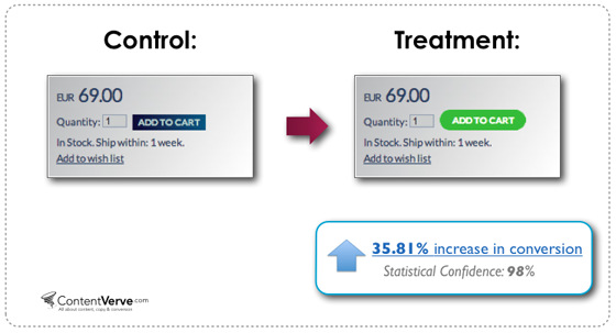
Via Unbounce
3. Toss navigation overboard
I’m sure your entire website is chock full of great information that any visitor would find valuable. But when someone is on your asset landing page, you don’t want them even thinking about the rest of your site. You want their focus turned solely on that specific page and tuned in only on that next step to conversion.
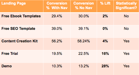
This is why you’ve got to get rid of your navigation menu on your landing pages. It serves only as a distraction that takes your reader away from that possible conversion. In fact, having a navigation menu present at the top of a landing page can drive down your conversions for that particular page. Here is a case study by Hubspot to prove the point.
Yikes.
You don’t want to give your readers any reason other than that CTA to leave a landing page. So say goodbye to the navigation menu.
4. Get visual with it
What’s a great way to boost conversions? Engagement. What’s a great way to increase engagement? Visuals.
If your landing pages are full of nothing but text, your readers probably aren’t going to be very interested in your asset. Shake things up by incorporating videos, images and graphics. This can be something along the lines of a short video that talks briefly about what readers can expect to see in your white paper, or a graphic showcasing some of the steps included in the guide you’re offering.
Whatever it is, you’ve got to use visuals – they can drive up your conversions by as much as 80 percent.
5. It’s give more, take less
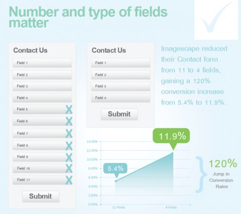
When you’re offering a detailed downloadable, you probably want a lot of information from your visitors in return. Well, this shouldn’t always be the case. Keep in mind that while the amount of information you’re requesting can be more when it’s something as in-depth and thorough as white paper, you should err on the side of caution and ask only for what you need.
As Jeff explains: “Businesses get something minimal, such as contact info, while the recipient is getting more than they’re giving. Your offer needs to be enticing.”
And that’s okay. After all, for every required field you have, you can expect a 1 to 2 percent abandonment rate. That’s not to say you should only ask for a name and email, but remember to request only the information you need and nothing else. Here is an old study by Imagescape that shows the impact of requiring many fields.
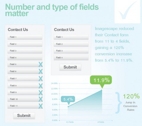
Via ConversionXL.com
6. It’s all about simplicity
Your landing page is there to convert, and that should be its only goal.
That’s why you’ve got to keep it simple.
“The overwhelming theme of asset landing pages is simplicity,” Jeff says. “That one purpose of converting visitors needs to be laser focused throughout the entire page.”
Besides removing the navigation menu and drawing readers’ attention to colorful CTAs, you can maintain that simplicity for conversions by cutting down on any content that doesn’t pertain to what you’re offering. Even better, help your readers take away the most important info by using bulleted or numbered lists and bold formatting.
Just keep this mantra in mind: If your reader doesn’t need to know it in order to complete a conversion, don’t include it.
7. One, two, three, testing
You can work all day and night on creating a landing page that incorporates all of the best practices above, but if you aren’t testing that page’s effectiveness, then kiss your conversions goodbye.
“Testing is critical,” Jeff states. “You can move around elements and A/B testing based on your goal. But if you don’t do A/B testing, you could be missing out on tons of opportunity.”
Let’s say you create that landing page, but you’re still not seeing conversions. Well, without that testing, how will you know if it’s your CTA colors, the content of the page or some other element that is turning prospects off? You’ve got to make sure you’re including testing in your landing page strategy so that you’re maximizing their value and bringing in the conversions you want.
Your asset landing pages are lead magnets. So don’t let anything get in the way of converting your visitors when it comes to developing them successfully and effectively.


