

Editor’s note: Updated February 2020.
Take some compelling info, add eye-catching graphics and voila: You have yourself an infographic. Simple, right?
I know – nothing in content marketing is really that easy. With more graphics than copy, infographics may seem like the picture books of content marketing. However, I’m sure you’re not surprised to find that it takes a lot to get there. Like other content marketing assets, there’s a significant amount of planning, research and creativity that goes into creating infographics.
Ready to get down to the nitty-gritty? Let’s talk all things infographics:
- Getting acquainted: What is an infographic?
- What are infographics used for?
- Why are infographics so effective?
- What are the main elements that make up an infographic?
- What kinds of infographics are there?
- How do you create an infographic?
- How should infographics be distributed/promoted?
- How do you know if your infographic has been effective?
- What does a good infographic look like?
Are you ready?
Getting acquainted: What is an infographic?
Infographics are visual representations of data and complex concepts that can be used in virtually any industry to cover pretty much any topic.
Venngage information designer Midori Nediger summed it up nicely with her own infographic definition: “Infographics are the perfect way to make dry, dense content engaging and digestible.”
These shareable graphics give data a visual facelift, using imagery, charts, icons and illustrations to present information in a way viewers can absorb in a matter of seconds. A good infographic will stand out from long-form copy as a more creative and engaging way to provide a topic overview, explain a process, display research findings, compare and contrast ideas, build brand awareness and more.
Heavy on design and light on copy, infographics are among the most powerful visual components of content marketing.
What are infographics used for?
Infographics are an important component to any well-rounded content marketing strategy. Marketers can create infographics for a variety of reasons, using them to grab audience attention, educate viewers and drive engagement via multiple platforms. Their eye-catching visuals are perfect for social media, email newsletters and even other websites. They can be especially useful for lead generation through building brand awareness and generating backlinks that take users from social media platforms and third-party sites back to your brand’s main website.
“A well-designed infographic with unique insights or interesting data can even potentially go viral,” according to Nediger. “People love to share stats and facts, and infographics are built around these irresistible bits of information. An infographic, shared in the right place at the right time, can translate into a ton of site traffic.”
An infographic, shared in the right place at the right time, can translate into a ton of site traffic.
You can also use infographics to repurpose old blog articles and whitepapers, especially those that had particularly high levels of engagement. Evergreen articles with step-by-step guides or listed information are especially easy to turn into infographics, using each step or subheading to guide the infographic elements. You can then embed the finished graphics within their accompanying blog posts so they can live as visual elements surrounded by optimized copy.
If you have customer survey data, research findings or company statistics, an infographic can also be an effective complement to the formal reports.
When done well, infographics can play a role in brand discovery, consideration, conversions and retention. Yep, that’s literally all the stages of the buyer’s journey. We weren’t kidding when we said these things were powerful. If your content marketing strategy doesn’t include infographics, you’re missing a huge piece of the puzzle.
Why are infographics so effective?
Infographics earned their cred in content marketing because our brains can process visuals much faster than words. There are also statistics that make it hard to argue against infographics, including:
- Users like or share infographics three times more than other types of content.
- Eye-tracking studies prove that people tend to ignore generic stock images.
- 90 percent of information transmitted to the brain is visual.
Plus, with attention spans growing shorter by the day, Nediger praised infographics for being “the perfect way to connect with fickle audiences.”
While these graphics perform like images, the copy allows them to tell a more complete story. You can easily share infographics with your audience, and you’re likely to see traction across multiple channels with their wow-factor visuals and easily digestible copy. As highly linkable and shareable pieces of marketing content, infographics can also serve as convincing sales tools.

What are the main elements that make up an infographic?
An infographic is more than just a pretty face: When done right, it’s a perfect marriage of visuals, copy, information and narrative.
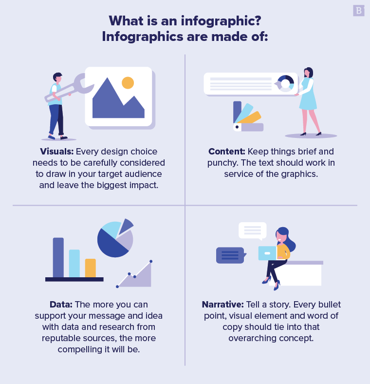
- Visuals: Infographics are, at their core, visual-based content. Every design choice, from the color scheme to the imagery, needs to be carefully considered to draw in your target audience and leave the biggest impact.
- Content: Copy adds context to the visuals, but keep things brief and punchy. The text should work in service of the graphics.
- Data: Infographics are typically informative, using hard data to educate the audience. The more you can support your message and idea with data and research from reputable sources, the more compelling it will be.
- Narrative: Your infographic should tell a story, whether you’re highlighting the state of an industry, packaging the results of a survey or offering tips and advice to your readers. Every bullet point, visual element and word of copy should tie into that overarching concept.
Visuals and imagery obviously will receive the most attention from your designers, but don’t overlook the other infographic elements. They are extremely important to creating a final product that’s engaging and interesting.
What kinds of infographics are there?
Before you can create an infographic, you’ll need to weigh your options. There are several different types of infographics to add to your repertoire, including:
The various sizes
Size and length will depend on the goal and content of your infographic. For instance, if you want to display a 10-step process, you can expect to have a short intro and then 10 brief sections of copy. When presenting survey results, consider how many data points are compelling and relevant enough to shape your narrative.
Note: In our experience with a myriad of clients, the top-performing infographics tend to have about 11 data points.
If you plan to lean on a content marketing agency to create infographics, the size often determines the price of the graphic. At Brafton, for instance, we distinguish silver, gold, platinum, platinum plus and interactive infographics by the number of included data points and level of design work necessary to fulfill the scope of the project.
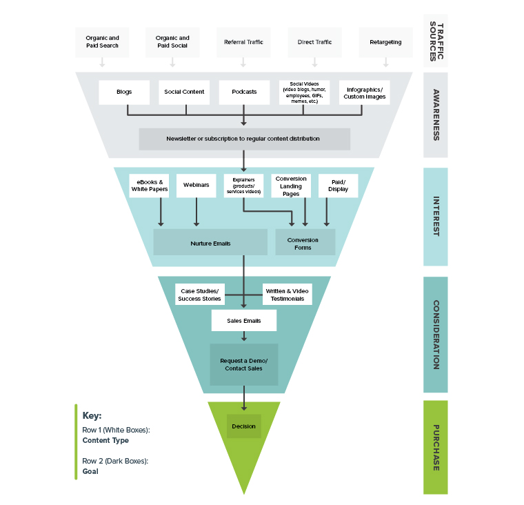
The flowchart infographic
This style of infographic starts with a single point and then branches off into different sections. Designers will often link the sections of the chart together with lines, dots, arrows or other simple elements. Similar to the flowchart quizzes in teen magazines, this type of infographic is great for engagement because viewers interact with the sequence of information.
Example: The ideal content marketing funnel template
The comparison infographic
When it makes sense to highlight similarities or differences between concepts, companies or products, comparison infographics are perfect for presenting such information. You can use them to prove your brand is the superior option, or take an unbiased look at two different paths.
For instance, a daring political science degree program may publish a Hillary vs.Trump comparison infographic, or take a more neutral route and use the visual content to compare degree concentrations and potential career paths for graduates.
Example: Inbound vs outbound marketing
The data visualization infographic
Data infographics include charts, graphs and other illustrations to add visual interest to statistics and units of information. Let’s face it: No one wants to stare at a bunch of numbers on the screen. Even the most insightful survey, study or report might get lost in the digital shuffle if the data isn’t presented in an engaging way.
Data infographics deliver raw data and statistics in a visually compelling package. They can also use imagery to provide additional context, draw the audience to especially pertinent figures or highlight the significance of the data. This kind of infographic works for relaying survey results, promoting company stats and presenting complex research results.
Example: There’s a stat for that: The strange and surprising side of social
The list infographic
With an educational purpose, this style lets the words do more of the talking than other types of infographics. They’re the evergreen blog posts of infographics, following a more standard structure of several subheadings and corresponding blurbs of body copy. Colors, fonts and icons enhance the copy to make it an enticing graphic despite the absence of data visualizations.
Example: 6 quick white-hat link-building tactics
The process infographic
Step-by-step guides and how-to content fall under this infographic style. Graphics, icons and imagery complement the sequential order of the copy. Whether it’s a do-it-yourself guide for creating small space storage or an overview of how to use a product, process infographics should provide clear directions. Unlike Ikea assembly instructions, these are meant to be easy-to-follow directions for all viewers.
Example: Your step-by-step guide to writing an email newsletter
The timeline infographic
Timeline infographic and process infographic are somewhat interchangeable terms, as their structures are virtually identical. While a process infographic guides users through a step-by-step workflow, timeline infographics walk through specific events in chronological order. There are a lot of different applications for timeline infographics: Showcase your company history to prospective customers, discuss the evolution of your industry or map out progress being made on an ongoing project for your clients.
Example: A brief history of content marketing and SEO
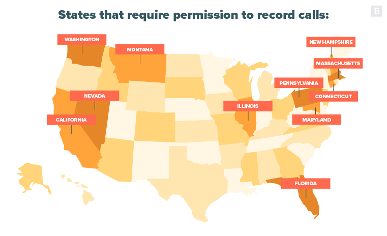
The geographic infographic
When there are maps involved, there’s a good chance the infographic is a geographic one. This style is used to visualize locations, present geographical data and display trends across regions.
Example: Case study questions: How to get satisfied customers to make a case for your brand
The interactive infographic
This souped-up infographic adds a layer of interactivity to traditional design features. It allows users to reveal information through actions like clicking on buttons, zooming in on specific areas and selecting from dropdown menus. That level of interactivity allows for a more personalized user experience and also directly engages readers by making them active participants. While interactive infographics are more time-consuming projects and require more advanced design skills, the result is something bold and creative that stands out from the crowd of static graphics.
Example: Happy Holidays 2022 from Brafton

How do you create an infographic?
You know what they are and you’re convinced that it’s time to create infographics for your brand – but that’s where you hit a roadblock. No worries, you’ve come to the right place. Here are the steps involved in creating a professional infographic:
1. Ideation
Behind every good infographic is a solid idea. Think about the data, concepts, processes or trends that are relevant to both your brand and your target audience. Our team often finds infographic topic inspiration in industry data, top trends, future predictions, how-to guides, practical solutions and brand identifiers.
We’re talking about topics like:
- 10 golden rules for content marketers.
- How to speak marketing.
- Connoisseur-approved wine and cheese pairings.
- The anatomy of professional websites.
- The wedding planner’s timeline.
- The do’s and don’ts of buying a new home.
You can also find ideas in your own content calendar. Build off your blog and social content with focused infographics.
Pro tip: Think visual from the beginning. Ideas that require lengthy copy to do them justice may work better for a blog post or white paper rather than an infographic.
2. Research
Once you have ideas on deck, you can dive into the research and data collection. Professional infographics are supported with indisputable data collected from the most respected institutions around. Hard-hitting facts and statistics are infographics’ best friends, so look for reputable reports, surveys and studies for relevant information that will work well in a visual format. Sort through internal data to find information that lends itself to visual representation, such as customer survey results, sales report statistics and insights from company leaders.
Pro tip: A hodgepodge of loosely connected statistics won’t resonate in an infographic, so keep that in mind as you collect your facts. Start thinking about a narrative to string together the data points during the research stage for a smoother writing process.
3. Copywriting
With research in hand, it’s time to start crafting the narrative that ties all the information together in a concise, organized and compelling manner. You’re essentially creating an outline to guide the design, which is why the best infographic copy is short and to the point. The more concise it is, the easier it will be for the designer to support the copy with graphics.
The introduction will be the most text-heavy of the infographic elements, setting the context for the data points to follow. Use punchy subheadings to catch the eye as well as break up the text into digestible sections. While maintaining brand voice is important, infographics generally allow for more flexibility and creativity in writing than more formal content, such as white papers.
The best way to win over your designer’s heart is to write with visuals in mind. Think of themes that will lend themselves to graphics. For instance, titling your piece “A sea of health IT benefits” and filtering in under-the-sea vocabulary where it fits points to an obvious design concept. On the other hand, “8 health IT benefits” doesn’t offer any immediate design inspiration.
Pro tip: Aim for an introduction of about two to three sentences, and then short yet complete sentences of roughly 15 words each throughout the piece.
4. Design
When it’s finally time to design an infographic, the No. 1 priority is to present the information in ways that enhance the message the graphic intends to communicate. How you choose to position the infographic elements largely influences how readers view and interpret the finished piece.
Basic design and visual elements such as lines, borders and shapes are key to separating sections of copy for easier interpretation. It also helps to develop a textual hierarchy. Try not to exceed three different fonts to keep the graphic easy on the eyes. Most designers will differentiate headings, subheadings and body copy with typography variations.
Color is also an effective tool for grouping information. One tried-and-true method is selecting one color that contrasts with the rest of the palette, using it to underscore the most important information. Feel free to use colors that aren’t in your brand guidelines, but try to create a consistent graphic style so viewers will recognize all your infographic content as your own.
Designers have an extensive toolbox of infographic elements they can use to bring the content to life. The elements you choose for your infographic will be largely dependent on the style and content. Some of the most effective include:
- Instructional diagrams.
- Flowcharts.
- Character images.
- Hand-drawn illustrations.
- Lists.
- Charts.
- Graphs.
- Maps.
- Timelines.
- Quotations.
- Statistical insights.
Another important note is giving credit where credit is due. You don’t have to clutter the design with references, but be sure to include a section at the bottom of the infographic that lists the resources where you found the data included in the copy.
Content marketers have two options to complete this stage of the process: template or designer. There are plenty of free infographic templates available online – like these from Venngage. You can simply pop your information into the template, personalize colors and fonts and export the piece.
Infographic templates lower production costs because you don’t necessarily need a graphic design expert to create visuals from scratch, make the layout and format everything so it all looks great. The downside is you aren’t able to customize the final product to fit your creative vision. There’s no flexibility to really give the graphic dynamic visuals and style that are unique to your brand. If some visual element isn’t included in the infographic template, then you’re out of luck.
Alternatively, you can hire a designer to create entirely original content. Many content marketing agencies – Brafton included – have in-house graphic design teams that work with strategy and editorial teams to create infographics. Your budget may determine which option is right for you, but keep in mind that quality and results can be worth the investment.
Pro tip: Work with negative space and grouping tactics to give the infographic elements room to breathe and effectively deliver their message.
How should infographics be distributed/promoted?
Once the infographic is complete, you’re ready to share it with the world.
Infographics are extremely versatile assets because you can easily distribute them across multiple channels and platforms. You can post them within blog content for maximum SEO value, send them out via email, share them on social media and even hand out or display printed versions at industry events. You can leverage all of the above for any infographic as long as you tweak the format to suit the platform.
Landing pages or blog posts are the best places to feature full infographics on the web. When sharing infographics on social media platforms, you’ll need to consider size restrictions on imagery. Infographics can be fairly long images, requiring users to scroll down the page to view the whole thing. They’ll grab the wrong kind of attention if you try to paste the entire graphic into a Twitter or Instagram post. Instead, create thumbnail images that highlight specific portions of the graphic and include a link that takes social media users to a landing page to see the full infographic. It’s also a good way to drive more traffic to your site: Give your audience just a taste on social media platforms, so they’re motivated to come to you to see what other insights you have to offer.
You may want to do the same thing when sending infographics to your email list, grabbing viewers’ attention and then sending them to your site to see the entire graphic. Make room for the increase in click-throughs that will be coming your way!
If it’s relevant for your content, consider reaching out to influencers or publications that might be willing to share your infographic with their audiences. You’ll also want to include embed codes wherever you post your infographics so viewers have the option to share them with their own networks.
Keep in mind that only sharing an infographic once really sells all of your hard work short. You can reuse the graphics to further leverage the content and enhance ROI. For starters, slice infographics into several thumbnails so you can keep sharing them with fresh imagery. As long as you repurpose the surrounding copy to support the highlighted section, you’ll keep grabbing viewers’ attention. You can also pull out specific data points to embed in other pieces of content as well as inspire future blog or social post ideas.
Pro tip: Google won’t pick up on the keywords in images, so make sure you post your infographic with optimized landing page, blog and social copy. That way, your infographics have a better chance of appearing in search results.
How do you know if your infographic has been effective?
Because infographics live on so many different channels, you can’t rely on site metrics alone to measure their performance. You need to take a wider view of the role infographics play in your content marketing strategy to get a good idea if they’re effective. Some major KPIs to look at include:
- Click-through rate: I know, we just said site metrics don’t tell the full story about infographic performance, but they tell part of it. If you have a dedicated landing page for your infographic and it’s generating organic traffic, that’s great news. But if those readers aren’t sticking around the site and checking out other pages, your infographic may not be all that impressive or illuminating.
- Social shares: Tallying the number of shares your infographics get on different social media platforms is a good way of gauging how people are responding to it. If no one’s sharing it, there’s probably something off with the design, data or concept.
- Backlinks: People love to link to infographics, especially with B2B blogs. The data is crystal clear, so readers don’t have to spend a lot of time off-site hunting for the relevant information. A well-researched, beautifully designed infographic that carries a really compelling narrative should pick up traction in the blogosphere. If you’re generating a lot of backlinks from third-party websites, then you know your infographic’s getting the job done.
- Click-to-open rate (CTOR): CTOR is one of the most telling email marketing metrics you can measure. It basically shows how many people who opened an email also clicked on one of its links. A high CTOR means users found your email content compelling enough to want to hear more. On the other hand, a low CTOR would indicate that people who liked the subject line and opened the email were so unimpressed with the content – including infographics – that they just walked away.
You can use tools like Google Analytics to track website traffic and reference social media reports offered by the platforms to measure engagement and interaction. For other metrics unrelated to your site performance, like backlinks and email CTOR, you’ll have to measure those yourself using other tools.
When you partner with a content marketing agency like Brafton, savvy strategists can do all the investigating for you. They’ll help you determine which KPIs are the most relevant to measure for your goals, and then keep track of them throughout distribution. You’ll see reports of the results, along with support for how to interpret the numbers. Once you know how well your infographics are performing, you can work with the marketing experts to determine how you can boost those results with future infographics.
What does a good infographic look like?
We’re big fans of good infographics at Brafton, as is apparent from how many we post on our own blog.
Remember when I said earlier that you can repurpose long-form blog content with an infographic on the same topic? I said that because we do it at Brafton all the time. Here’s an example: We amped up my original “7 steps to click-worthy blog title ideas” post with an infographic that essentially summarizes the article through a visual representation of the steps.

It’s for those who don’t want to scroll through the entire post, but still want the benefit of knowing how to write click-worthy blog titles. (No offense taken – I get it.)
We followed the same tactic to express our thoughts on link building and SEO marketing plans – and will likely keep doing it with other blog posts in the foreseeable future.
The other infographics we create inside the walls of Brafton are for our clients. Here are some examples:
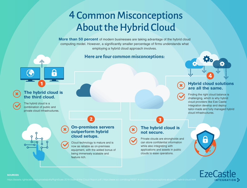
Debunking hybrid cloud myths
This infographic follows the list style, and utilizes cloud illustrations to quickly convey the message.
Mortgage decisions
This is also an informational, list-based infographic, but it follows a vertical progression rather than the horizontal style of the EzeCastle example above.

Customer Experience Maturity Model
The design still takes the cake and draws viewers in even though this infographic has more copy than most. Take note of the CTA at the bottom, easily distinguished by the change in background color.
The job search
This data visualization infographic gets into the numbers in a super aesthetically pleasing way.
Are you ready?
Go forth, young grasshopper, and see what you can do for your brand with infographics. We’re here if you need any help along the way.